With iFrame widgets, you're free to build a web app with the framework of your choice, and craft any feature you want. Because it is web-based, this is an extremely powerful solution to provide rich features straight in the Crisp app. Sky is the limit!
Use Cases
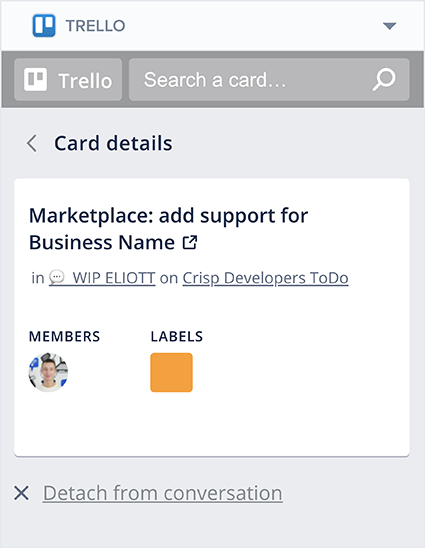
As an example, our Trello and Shopify widgets are iFrame widgets. Behind the scenes, they are both powered by a lightweight Vue.js app. They make use of the widget JS SDK as well.
Widget Schema
An iFrame widget is defined as the following (see the full reference):
{
  "version": "1.0",
  "url": "https://acme.com/widget.html"
}Some parameters are passed along the GET request to the iFrame URL:
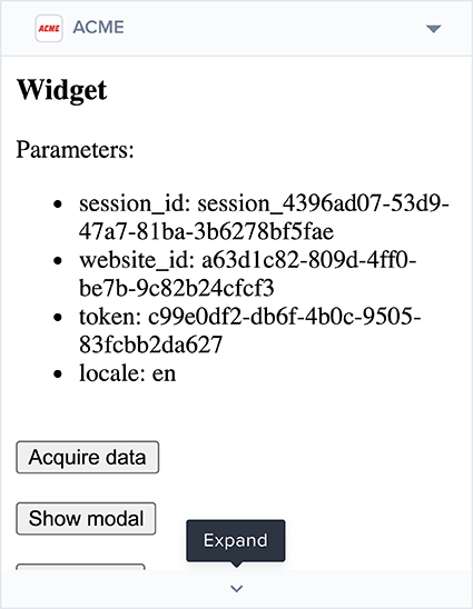
website_idsession_id: only if your plugin has at least onewebsite:conversation:*token scope grantedtoken: the token of the website requesting your widget (corresponds to thetokenvalue as retrieved from this route or this route). You can use this token to validate that requests to your iFrame widgets are coming from the Crisp app.locale
The resulting URL will have these parameters added as query parameters, like so:
"https://acme.com/widget.html?session_id=session_4396ad07-53d9-47a7-81ba-3b6278bf5fae&website_id=a63d1c82-809d-4ff0-be7b-9c82b24cfcf3&token=c99e0df2-db6f-4b0c-9505-83fcbb2da627&locale=en"You can also embed Crisp data in the URL, via the data binding syntax (see more details here):
{
  "version": "1.0",
  "url": "https://acme.com/widget.html?order_id={conversation.meta.data.order_id}"
}
Sizing
The height of your web page is automatically propagated by the Widget JS SDK. This ensures that the proper sizing is applied to the iFrame embedding your web page.
The maximum height of the iFrame embedding your web app is 300px. If your plugin is taller than 300px, it will be scrollable, like a regular page. The user will also have the possibility to expand it via a button located at the bottom of your widget. By clicking on it, the conversation sidebar will be cleared of its content (ie. the user profile and all the other widgets), and your widget will be the only one remaining: it will be able to fill the whole height of the Crisp app.
If the height of your widget or modal changes after the DOM initialization, you can propagate the new value, by calling the setHeight method:
$crisp.setHeight(document.body.scrollHeight);Data Access
You can access to Crisp Data from the iFrame widget. In many cases, this can eliminate the need for you to make additional requests to our REST API.
window.onload = () => {
  // Register data acquired callback
  $crisp.onDataAcquired = (namespace) => {
    console.log(namespace);
    console.log($crisp.data[namespace]);
  }

  // Acquire conversation data
  $crisp.acquireData("conversation");
};
Modals
In addition to the iFrame widget itself, you can open modals from it. A modal is displayed above the Crisp app itself. Controls ("Open in new tab", "Close", "Minimize" and "Move" buttons) are available bellow the modal.
Modals can be used in the following situations:
- To display a warning, alert or confirmation
- If a process of your widget requires user-submitted information
- For a long, multi-steps process
To display a modal, simply use the showModal method and provide the URL to open (see more details here):
window.onload = () => {
  function onButtonClick() {
    $crisp.showModal("https://acme.com/modal.html");
  }
};
The exact same parameters as the iFrame widget URL are passed along in the modal URL:
"https://acme.com/modal.html?session_id=session_4396ad07-53d9-47a7-81ba-3b6278bf5fae&website_id=a63d1c82-809d-4ff0-be7b-9c82b24cfcf3&token=c99e0df2-db6f-4b0c-9505-83fcbb2da627&locale=en"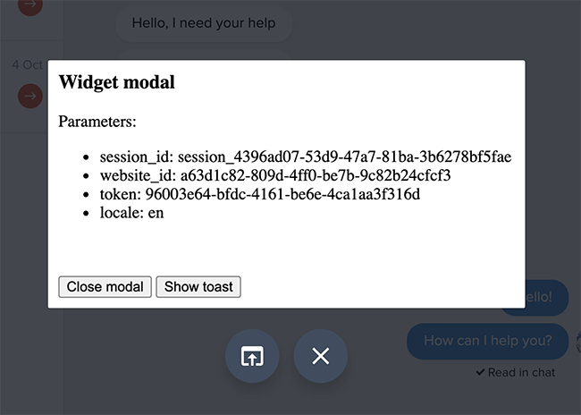
Widget communication
When a modal is opened, it represents a second instance of your web app (the first one being the iFrame widget itself). It is like having two browser tabs open, each with the same website.
Because these two instances are separated from each other, you may feel the need to communicate between the iFrame widget and the opened modal:
- To keep the local state of the iFrame widget in-sync
- To provide context from the widget to the modal, once it's opened
- To back up data when the modal is about to be closed
- To send user-submitted information from the modal to the widget
Communication can be established using the forwardEvent method (see more details here):
$crisp.forwardEvent("widget", {
  result: {
    title: "A title",
    description: "A description",
    end_date: "Jan 21, 2021, 4:43 PM"
  }
});
Toasts
Toasts are displayed at the bottom of the Crisp app. They share the very same visual aspect as the regular toasts used in the Crisp app.
You can choose to display a toast in order to indicate a success, an information, a warning or an error (see more details here).

Styling
When building an iFrame widget, you are fully responsible for the visual style of your widget.
If, however, you would like to match as closely the style of a generic widget, and you cannot use generic widgets for your use case and have to rely on an iFrame widget instead, we have got you covered. Please refer to the Generic style section below.
Generic style
1. Import the generic style stylesheet
If you would like to replicate the exact same style as generic widgets in your iFrame widget, you should include the following stylesheet URL within your HTML <head />, as such:
<link rel="stylesheet" href="https://assets.crisp.chat/widget/stylesheets/widget.min.css" type="text/css" />Then, wrap all your plugin HTML inside a container with the caw-widget CSS class, within your <body />:
<div class="caw-widget">
  <!-- your widget code goes here -->
</div>
2. Available generic CSS properties
Section styles
Sections are used as group of elements, such as buttons. They can be expanded and collapsed by the user.
A section has a header, and a body. The header contains the name of the section, and can also be clicked by the user to toggle the section body visibility. The body contains elements, eg. buttons.
A section can be inserted in your HTML as such:
<div class="caw-widget-section" data-deployed="true">
  <div class="caw-widget-section-header">Your section title goes here</div>

  <div class="caw-widget-section-body">
    <!-- your section body goes here, eg. buttons, empty label, etc. -->
  </div>
</div>
If your section body has no content, you can also show an empty message (within caw-widget-section-body):
<p class="caw-widget-section-empty">Your empty label goes here.</p>data-deployed value accordingly (to true or false).Button styles
Buttons can be interacted with by the user, in order to take an action. With iFrame widgets, they are usually used to make a request to the plugin server widget API.
A button can be inserted in your HTML as such (they are usually nested in sections, read above):
<span class="caw-widget-button" data-color="black" data-pending="false">Your button label goes here</span>You can customize the button color using data-color, with values:
blackbluegreenorangeredpurple
data-pending value accordingly, whenever a network request following a click is pending (to true or false).